TigerSafe is a redesign project, specifically tailored to address the safety concerns of college students at RIT. It offers safety support and practical solutions whenever necessary.
This is a school solo project, I was assigned the task of evaluating the current TigerSafe app and redesigning it to better fit the RIT experience.
I independently completed the information architecture design, user experience design, and user interface design for the app. Additionally, I conducted heuristic evaluations and engaged in ideation and brainstorming sessions with my classmates, which provided valuable insights for this project.

TigerSafe is the official safety app of RIT.
Although there are posters everywhere on campus promoting the safety app, it doesn't have as many downloads as one would expect.
With a 2.5 rating on IOS platform, many have complained about the lack of usability and the outdated user interface.

When I researched what other university’s safety app look like but found that many university use the same safety app as RIT do. They are all designed by the same company with the same template.

Bad user experience
Complicated functions
Inadequate for emergencies
With 181 crimes reported at RIT in 2020, it is important for the safety app of the school to function as an effective tool to safeguard students and employees from mental or physical harm.
Unfortunately, the current safety app is poorly designed, making it difficult to provide the necessary support for ensuring the safety of individuals on campus and during their commute home.


In order to determine what kind of safety related scenarios students and employees might face, I went through the campus.


RIT has long, underground tunnels that can sometimes be dark with no one is inside.
If no one is there, the possibility of being stalked or getting locked in the room by accident can be life threatening.

When students want to work alone in the lab at night, they can be the only one in the some of the emergency phones in the building do not work, which is a massive safety concern.


The walk from the classrooms to the dormitories is long and it can be unsafe at night or in the dark cold winter. If students want to reach the blue light, which is outdoor emergency phone outdoors, it will take some time to get to a blue light.
Design an experience for RIT users that make them feel safe when they are alone on campus while providing them with support and practical solutions when they need it.
I conducted a heuristic evaluation to analyze the original version of TigerSafe.
To eliminate the limitation of conducting the heuristic evaluation by myself, I formed an evaluation group with my classmates.
I assigned them to evaluate the app using some principles from NN Group. Each individual evaluator inspected the interface alone. After all evaluations were completed, we aggregated our findings.
Some functions such as “Call/Chat with Public Safety” are distributed across 4 submenus, “Emergency Contacts, Blue Light, Say Something, and Safety Toolbox”, lead to unnecessary, complex and confusing screens.

Although it uses RIT branding colors, it does not evoke a sense of safety or calmness.
No contrast between background and characters.
When it comes to safety, some functions have a low priority.
The visual communication information is unclear and does not align with the explanation texts. To international students, some function names are confusing.
Using too many descriptive words for each function can be impractical during emergency situations and may discourage users from using the app’s features.

Users may have difficulty finding relevant information unless they sift through all the information presented on the screen.
Users can only reach out to facilities by filling out a form. Additionally, users can not see the facility’s reply.
I restructured the function hierarchy, and identified four key points that should be focused.

Before diving into the design process, I established a set of design principles and goals to guide my next steps.

Every second is valuable in a safety-related situation, so users need to be able to access safety features as quick as possible.

Create a user flow that is simple and straightforward, eliminating any unnecessary steps or cluttered interfaces.

Utilize visually clear and easily understandable elements to offer users actionable guidance that they can readily comprehend and follow.

Give the user a delightful user experience and make them feel safe and supported.


The initial step involves simplifying the complex information architecture.
During the first iteration, I aimed to retain certain features from the original TigerSafe app. I categorized the functions into 'Emergency' and 'Other' sections based on their order.
However, I soon realized that this division was too ambiguous.
As a result, I reorganized all the functions and incorporated 'Emergency Map' and 'Party Mode' into the new information architecture.


After sketching ideas based on the second version, I realized that the structure still appeared cluttered and did not align with my design goals.
I needed to find an alternative approach to create a lighter app experience.
Feeling stuck, I decided to revisit the current TigerSafe app and conduct further research. During this process, I discovered that all user requests are directed to public safety.
This revelation allowed me to reassess the prioritization of features from the second version. I eliminated lower safety priority features, combined functionalities, and simplified the whole information architecture.

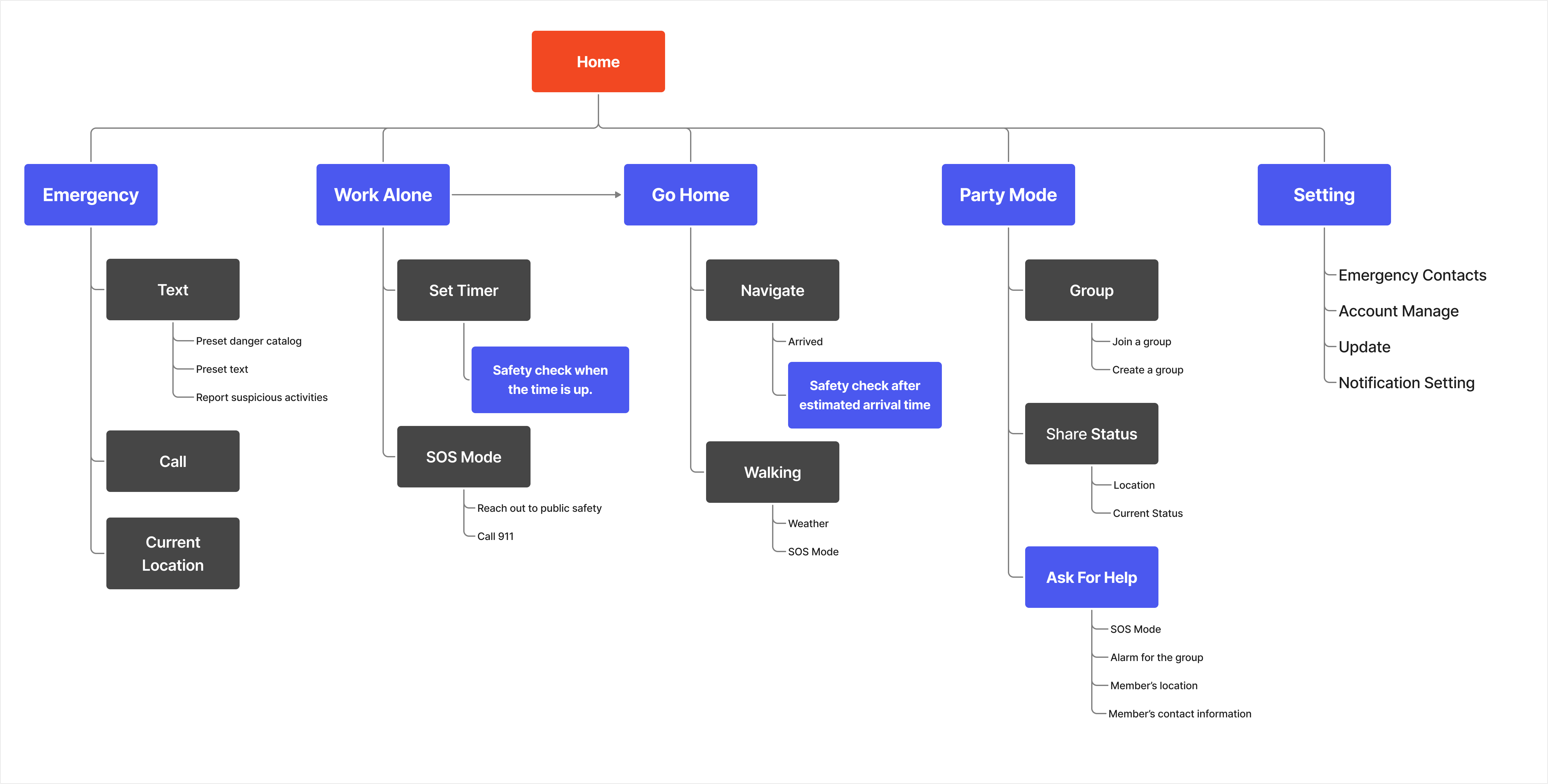
While constructing the information architecture, I developed wireframes to explore the visual layout of each feature.
I began by sketching on paper and then created low-fidelity wireframes in Figma.
This process enabled me to establish the connection between each page and gain a better understanding of the overall user experience.

The "Emergency" button enables users to quickly seek help from public safety.
In comparison to directly calling 911, this feature in TigerSafe can automatically provide user information such as their name, location, and other relevant details through their logged-in account.
This reduces the time between initial contact and dispatching assistance from a traditional 911 call.

Although the emergency feature may not be frequently used, it remains a top priority and must be readily accessible during emergencies. Therefore, I have made the emergency button the focal point of the main page.


A and B were not preferred because adding menus would introduce additional steps for users to access the desired function, except for the emergency function. However, the idea of displaying the current location was considered informative.
C was found to be confusing, especially in high-pressure situations, as users might struggle to decide between calling or texting for both emergency and non-emergency situations.
D had functional layout but lacked the expression of a safety feeling. Ultimately, I chose to proceed with E.

Hide secondary actions in a hamburger menu to keep the user interface clean.
The emergency button mimics the button from the emergency phone in RIT.

Other frequently use functions can also be easily accessed on the same page.
Users can choose either call or text to reach the public safety, depending on the scenario.

The preset emergency safety types cover common situations that may occur on the RIT campus.
The map display can help users convey geometric information efficiently and clearly.
A default message that includes the user's name, location, and type of emergency.

Realtime emergency chat
RIT students have demanding curricula, with some needing to work in labs until late hours, while RIT employees may also have work responsibilities until sundown.
As the campus grows darker, the presence of fewer people poses potential safety concerns, especially compared to the morning hours. Users may frequently find themselves alone in such situations.
This function serves as a solution to address the safety hazards associated with working alone on campus at night.
When students are studying alone, they have the option to set a timer that serves as both a concentration timer and a safety monitor.
Students can activate the SOS mode at any time by pressing and holding the countdown button.

After the time is up, the app will check whether or not they are safe.
After users' working sessions, it can often be late, whether they live on campus or outside of it, which can pose potential dangers based on previous data concerning the campus and the city.
The "Go Home" feature tracks users' entire journey to their destination, enabling them to share their location with family or friends.


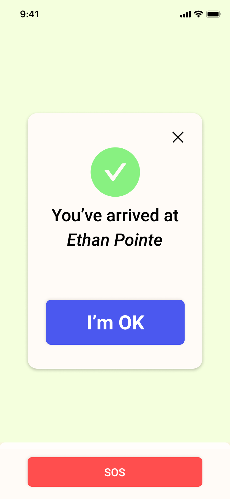
Users will be required to enter their predetermined PIN number to verify their safety.
In case of an emergency, the SOS mode will start a countdown and send a text message to the user's designated emergency contacts.

Night time parties and events are common occurrences at RIT. Despite people reminding each other to notify them when they’ve arrived home safely, people rarely remember to do.
In this function, users have the ability to create or join groups where members can check each other's status to determine if they are still on route to their destination or have already arrived.


If any member needs help and it will be visible on the map in real-time.

Collaborating with other designers proved to be more efficient and comprehensive, leading to a more responsible design.
I learned how to utilize the heuristic evaluation method. This method let me to focus on its usability and adherence objectively and establish design principles.
In the context of this safety app, it was crucial to convey a sense of safety and friendliness to the users. Colors and rounded corners emerged as powerful design elements that could effectively communicate these emotions.
I intend to conduct a usability test to observe how users interact with the app in various simulated scenarios. This will provide valuable insights into the app's strengths and weaknesses, allowing for iterative improvements based on user feedback.
Add additional functionality to the navigation and notification systems.
I recognize the importance of conducting further research in collaboration with RIT public safety. Their expertise and knowledge of safety scenarios are invaluable resources that can greatly contribute to the app's design.I aim to design a dedicated version of the app specifically for public safety personnel to interact with student and employee safety requests.
